

Suggested Reading
Article
Essay
Le Random: An Origin Story
thefunnyguys
•
September 3, 2026
View


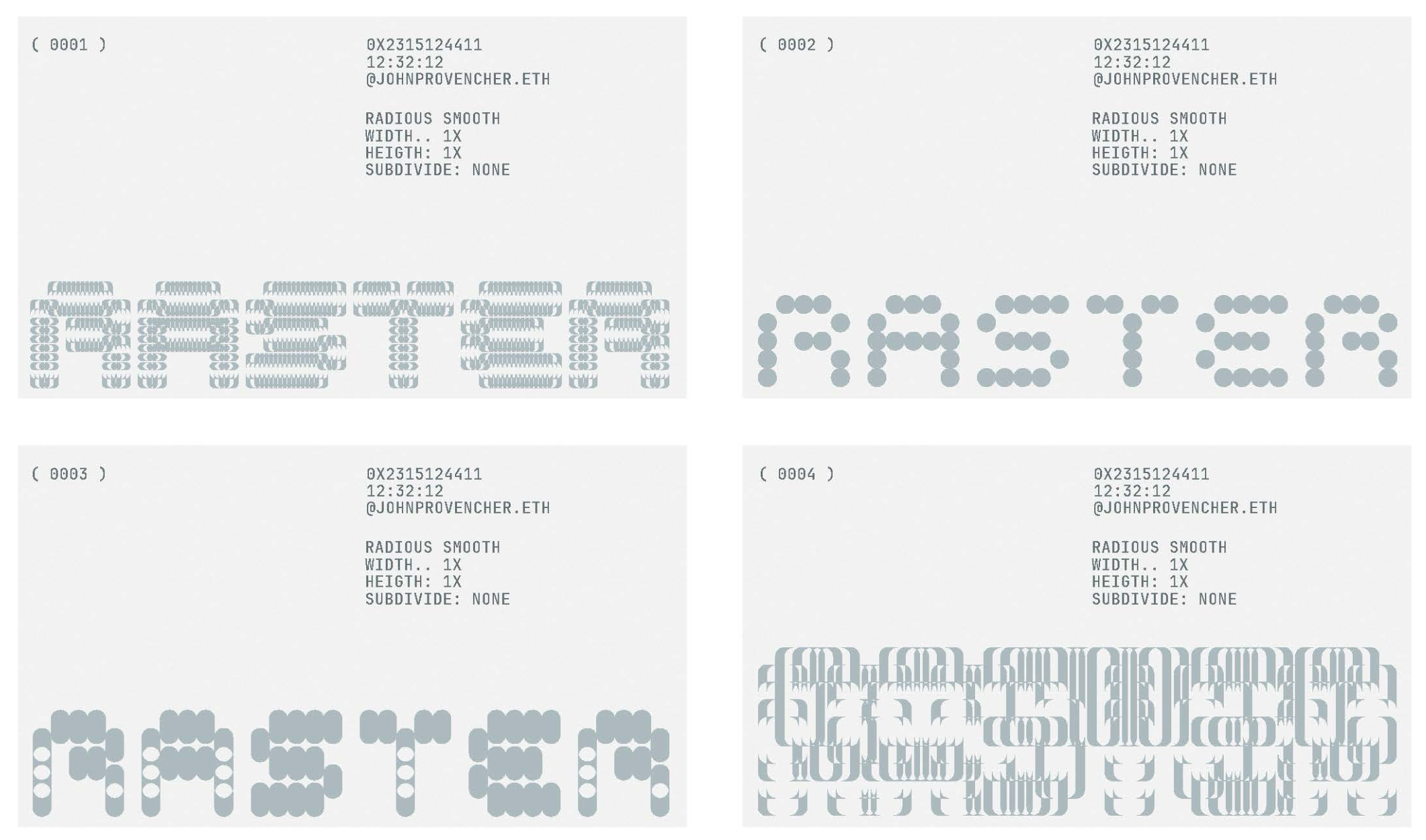
Artist John Provencher joins Raster’s founders, thefunnyguys and Michael Elsdoerfer, to discuss collaborating on the generative system, Raster Logo. With Peter Bauman (Monk Antony), they cover the bitmap wordmark at the system's core, the inspiration for a generative logo and what Raster's founders make of the platform's first year.
Peter Bauman: Why was John the right collaborator for this project?
thefunnyguys: John’s practice is quite unique. We were familiar with his on-chain generative work as well as his incredible commercial graphic design work, where pixels, rasterization, and generative typography play an important role.
There are very few practices at this intersection and it turned out to be the perfect background to make this logo project special. We didn’t know at the time but it also happened that John had been wanting to work on a logo project in the NFT space for quite a while. Turns out, he had been waiting for the right opportunity to come along.
Peter Bauman: The idea of having a generative logo, thefunnyguys, goes back to founding Le Random. What’s that story and why did the concept persist to Raster?
thefunnyguys: Le Random exists to celebrate generative art, which we broadly define as systems-based art where the artist cedes some control to randomness. The typical logo creation process is the opposite of that. You agree on one canonical, static asset, which is then never altered and endlessly repeated.
This method has its reasons and benefits, especially in the physical world, but for Le Random we thought it would be great to demonstrate our mission by committing to a generative logo system. We invited Marcelo Soria-Rodriguez to create Aleatorio, which, for a few reasons, doesn’t actually function as our logo, but it does still welcome visitors on our homepage.
The challenge back then was we first created Le Random’s logo and wordmark with a design studio only to invite Marcelo afterwards to take that logo and turn it into a generative system. That’s really difficult to do.
This time, John was able to work from a clean slate and do his thing without ties to an existing logo or wordmark.

Peter Bauman: And John, what did you do with this clean slate? How did your background in web and graphic design inform your approach?
John Provencher: I think it made the project pretty exciting. When I used to work on identities and websites earlier in my career, I would always try to make space for some kind of generative or computational element. So it was nice that this project was centered around that from the beginning.
Every part of it could point back to this idea of “rasterizing.” We worked almost backwards from what was happening in the generative piece. Then created the typographic and graphic identity from there.
I didn’t want to take an overly corporate approach. I tried to treat it the way I treat most projects and focus on what is unique about it. People can think of logos as boring or purely utilitarian but that was actually a fun constraint for this project.
Peter Bauman: With that generative element baked in, were there any particular technical challenges with the work? How important was it to make a dynamic as well as a still version?
John Provencher: I sketched the dynamic and static versions at the same time. The static version is basically the grid for the entire piece.
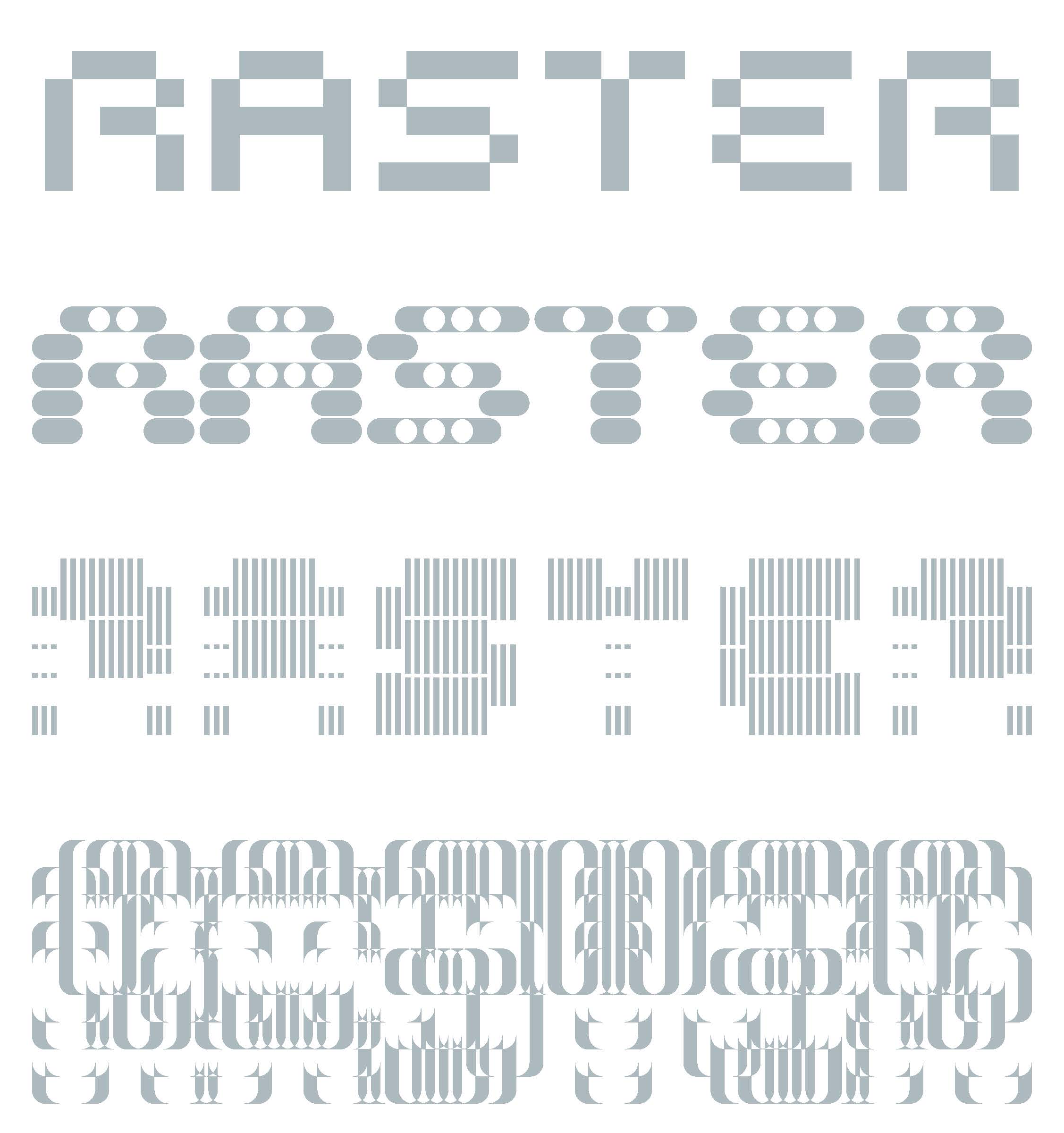
I started with this bitmap typographic wordmark and was exploring the least amount of cells that you could use to still communicate the word “RASTER.” The real challenge was adding enough variables and chance so that the system could hold some surprises while keeping the simplicity intact.
Logos still have a very basic role on something like a website. They need to be grounded, you know? Sometimes you just want one mark that acts as an anchor for everything. When the generative logo gets used, it's like a nice expression or surprise.
Peter Bauman: What inspirations did you draw from?
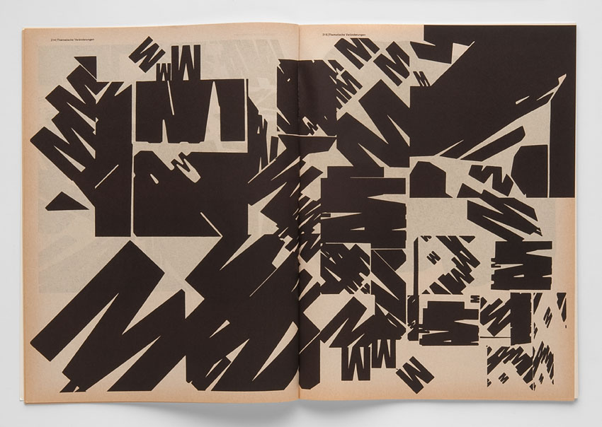
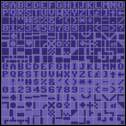
John Provencher: Early sketches mostly drew from bitmap fonts, which connects back to early technology and typography. When the logo starts to express itself more, there are definitely some references to modernist typographers like Wolfgang Weingart or Wim Crouwel.
As the variables started to expand, it started to remind me of one of my favorite typefaces, Blur by Neville Brody from the 1990s. I’ve always loved this typeface! It was tackling similar ideas of simplicity versus expression. These all came to play for sure but wanted to take these older ideas and make something new.
Peter Bauman: Speaking of combining old and new, how has your workflow for generative projects changed since the fairly recent paradigmatic advancements in coding tools?
John Provencher: I still really like coding by hand. I’ll code a lot of it myself and take my time with it in the beginning of the process. I think that’s often where you start to find something interesting.
The tools are great for more technical fine-tuning or if you need to iterate through quick explorations. It also helped that thefunnyguys has been able to use Claude to generate front-end ideas and integrate the design from the identity over time. We were pretty collaborative in that aspect, which was a lot of fun actually and I don’t think that would happen without those tools.
Peter Bauman: John, how does this project align with and differ from your art practice, where you engage with the generative nature of the World Wide Web as a medium?
John Provencher: This project is quite different from my independent work. I try to treat most of the work I do as an experiment in my practice. This project felt more like a collaboration between me and Raster but it still felt like something new to try personally.
When they approached me about it, I had a rough idea for it and I thought it would be interesting to work on because I didn’t really feel like it existed yet. That gave me a lot of energy around the project.
I’m not going to start doing a bunch of logos, haha. But I was happy to try something new and use a set of my skills that I haven’t really used in this space before.
One aspect I really like is when I used to make websites and identities, there was always this idea that somebody coming to a site could get a logo of their own or participate with the identity in some way. Now that can actually happen! Even if it’s in a relatively small way. That part is really fun to me and I hope to build on that idea in future work.
Peter Bauman: Your independent practice centers ‘90s net art and early internet nostalgia. Growing up in the ‘90s, what memories do you have from that time that may have informed this core element of your work?
John Provencher: I don’t feel especially nostalgic about it. I think digital and internet art is still very young. Along the way there have been a lot of ideas that I think are worth holding onto.
That’s a big part of my practice. There are developments in software, video games, websites that were once utilitarian but disappeared because they were no longer useful or because a newer ideology replaced them.
I think it’s important to herald ideas and aesthetics that you still find interesting and push them further.
It’s similar to this project in that sense. You’re taking ideas from graphic design that can actually be quite old and moving them into a different context. It’s less about nostalgia for a particular time and more about protecting certain crafts and ideas that I still find interesting and continue to draw from.
We even drew some inspiration from my new Commodore 64 matrix printers (from the 1980s!) as a way to rasterize the project description on the mint page :-}
Peter Bauman: Michael and thefunnyguys, did you take inspiration from the fx(hash) (R.I.P.) generative logo collections or any other similar projects?
Michael Elsdoerfer: I was definitely interested in what fx(hash) had done. We thought a lot about what a generative identity could be. One thing that was important to me was that the generative system shouldn’t just produce artworks based around our logo but that the logo itself should be generative.
I like the idea that there is no distinction between the “real” Raster logo and the generative project; the identity itself is a system.
The individual outputs in theory could all function as the Raster mark. There isn’t a conventional logo sitting behind the project that John then built something generative around.
thefunnyguys: For myself, not really. We were aware of fx(hash)’s generative logo but ours is quite different. For that project, ciphrd wrote the brand name in a specific font then used it as a base from which a generative simulation grew outwards.
For Raster, the logo itself mutates. Even the static wordmark we show on our website is just one specific output from the generative typography system.
Peter Bauman: Michael, how does this project reflect what you’re trying to accomplish at Raster?
Michael Elsdoerfer: They are quite intertwined. We created the initial Raster brand identity, our website and our logo around the same time. They evolved alongside each other.
Of course John was also involved beyond the logo itself, helping with the site’s aesthetics and in general providing his expert design advice. The horizontal filters that we are now very proud of originally came from one of John's sketches. Yes definitely, things like the grid, typography and the general visual language naturally ended up speaking to each other.
Peter Bauman: What is this project to you guys? An artwork? A membership token? Is there any kind of utility? What’s its goal?
thefunnyguys: It’s just a fun collaboration between John and us that ideally stands on its own as a generative design project. I hope people will mint tokens because they find the system compelling and because they think Raster has a mission worth supporting. We don’t see it as a membership pass and have no intention of tying any utility to these tokens.
Peter Bauman: Finally, the project’s release date also marks Raster’s one-year birthday. Do you have any reflections on Raster turning one?
thefunnyguys: We’re thrilled the platform is running and to see that there are already collectors and artists who find Raster useful. But the overwhelming feeling is that there’s still so much work ahead for us, that we have only scratched the surface.
I think we’ll look back at the first year as a year in which we got the basics right, hopefully making it easy for us to iterate quickly and develop wonderful new collector experiences moving forward.
------
John Provencher is an artist whose practice explores the generative nature of software as a tool to output works both on and offline.
thefunnyguys is the co-founder of both Le Random and Raster.
Michael Elsdoerfer is the co-founder of Raster, a long-time developer and art colletor.
Peter Bauman (Monk Antony) is Le Random's editor in chief.